Pages

Showing posts with label composition. Show all posts

Friday, 17 June 2022

The Danger of Looking Back and Getting trapped in All Our Yesterdays

A respected friend and colleague once said to me: ‘At our age it’s dangerous looking back at the past’. That struck a chord as I was considering revisiting a picture story I had shot almost 40 years ago and I really didn’t want it to turn into ‘all our yesterdays’. I decided the real danger was that once you start looking back you might never stop, and looking forward would be a thing of the past. 


My dilemma was this: in 1983 I documented George Norris, a 19-year-old Rag and Bone man in Hull. We’ve been in touch ever since and he called me to say he was back on the carts, but this time with his 81-year-old father, George Snr, who had been collecting scrap since he was 13. 

Rag and Bone man George Norris Snr attends to his horse and cart in the 1960s in Hull.           Picture Keith Wade

On the one hand this was a terrific opportunity to photograph him again, looking at what had changed in Hull over the past 40 years, and what had not. On the other hand, I feared I was retracing old steps and reliving my past. In the end, I decided it’d be fun spending time with George and I’d get my step numbers up too. George agreed immediately but I suggested he thought it over, asked his dad, thought about it again, and then replied in the cold light of day. Yes again. 

I now had to decide how to shoot this and, more importantly, why. In 1983, as an art student, I shot the whole story with a Minolta 100b camera, mainly using a 35mm lens and all on black and white film. In our 2022 post-digital revolution I could go all-out analogue by dusting off my old Nikon FE and slapping on a 35mm lens. I rejected that idea. I was not interested in trying to recreate the style of what I had achieved in 1983 as this would be stepping on to the slippery slope towards all our yesterdays. Two reasons for this: I might discover that I hadn’t improved as a photographer, and I had already recreated a picture for fun… 

About five years ago when I was visiting George, we decided to recreate one of my pictures. George had to tap up a mate to borrow a horse, we had to find the right junction on Woodcock Street where the housing had long been demolished, and avoid the traffic. It was chaos. George was bitten by the horse, which reared up and tried to kick him, much to the amusement of its owners, the traffic backed up and we were shouted at by motorists. But we got a nice picture that features on the Cafe Royal Books publication ‘George Norris Rag and Bone Hull 1980s’.  


Apart from avoiding slippery slopes, I was unclear what story I wanted to tell. Was it George then and now? Was it George and his father’s Rag and Bone legacy? Was it the demise of the traditional Rag and Bone trade? Or were these Rag and Bone men appearing as bit players in Hull’s changing cityscape? 


But I ditched any preconceived ideas and decided to go out with my cameras and see what happened. I also threw in a wild card:  as well as shooting on 35mm digital I carried a Rolleiflex and shot black and white film. The attraction here being the square format and the slower pace of composition and shooting. Conscious that I’d be doing a Q&A on video, I also needed some B roll and would shoot that on my iPhone.


What I learned on day one (12,000 steps) was that the story needed the actual voices of George and his father, not just quotes in text, so the planned video Q&A session gained importance. What also became apparent was that the ‘then and now’ pictures were happening in front of me whether I liked it or not. Not only in the repetitive nature of their work but in terms of line, shape and composition within the cityscape.


My content had mushroomed. In 1983 it was black and white film in 3:2 format. In 2022, it was 3:2 format colour digital, Q&A video shot at 16x9 on the DSLR and mic’d for sound, iPhone video B roll and square format 120 black and white roll film. Well, I suppose ‘Content is King’.  I was editing the file down and captioning the pictures after each day’s work to try to keep the mushroom contained. 

This was the pattern of the day’s work. At 8.30 sharpish George Norris Snr would sound his horn outside George’s house and the three of us would squeeze into the cab. He would then get ‘a vibe’ as to where they’d call the streets, and ‘if aught were comin’ out’ a new area would be tried. By 1 p.m. (day 2, 18,000 steps) we’d head off to Neise’s Diner for lunch. A dice with death to cross the road as George Snr refused to use the crossing. Steaming hot steak and kidney pie with mash, veg, a cuppa and a pudding, with custard of course, countered the good work the steps were doing on my midriff and all for £6. Then to the Griffiths Group, Metal and Waste Recycling (we don’t call them scrapyards anymore, recycling is the buzzword) to offload the morning’s collection.

George Snr would drop us back at George’s house. A power nap for George while I got down to editing and captioning.


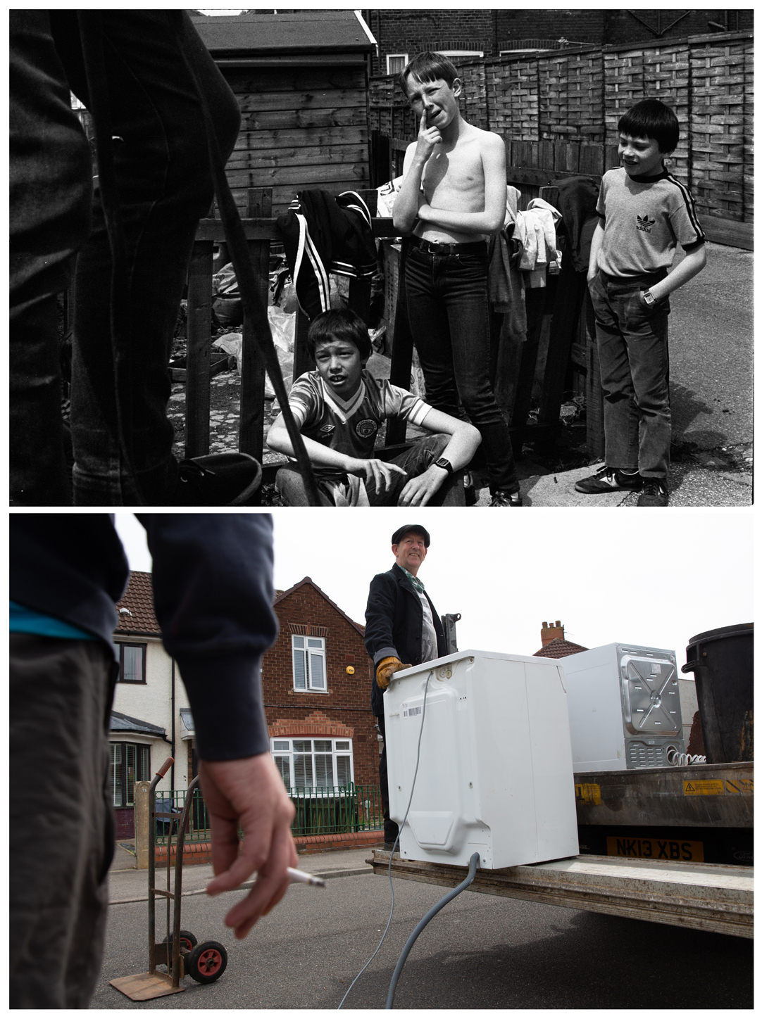
By day three (20,500 steps, we went out that night too) I had come to realise that the pictures I shot in 1983 should be the story’s visual base element and that would rein in the visual chaos I was creating. By looking back at my original pictures I was able to build on that foundation and begin to structure the story visually. None of the pictures, either in 1983 or 2022, were posed or set up. 

When I saw the opportunity, I worked hard to position myself so a detail like the roof line was at the same angle as the picture shot in 1983 while George pounded the streets. Parked cars and wheelie bins in pictures taken in 2022 destroyed many of the compositional lines the pictures had in 1983. Their bright colours were a distraction. 


I experimented with removing the colour from the 2022 images to create black and white combination pictures. Although initially it seemed like a solution to the problem of mixing black and white and colour, it quickly looked like a pastiche and I felt I was staring down that slippery slope again. 


Apart from the obvious differences - no horse and cart, no flattened Victorian housing, no second-hand shops and no obvious signs of unemployment and poverty - there was a noticeable shortage of people on the streets, which was a concern for me. Also missing was the modern equivalent of one of my favourite pictures from 1983, June outside her second-hand shop, a type of business that just doesn’t exist anymore.


I began to think beyond the more obvious visual aspects of combination pictures - repetition of action, line and shape - to examine the notion of using sentiment to combine images. I thought at first that visually this would be like adding tomato ketchup to custard in Neise’s Diner. I tested my idea on a friend who’s a terrifically creative editor (not the custard and ketchup idea, the picture idea) and it began to make sense to us both. The example below uses the eye line as the common factor to make the link.

To help me sort out the chaos (day five, 10,000 steps) I got all the newly edited pictures printed and spread them out of the floor. The distraction of a drugs bust at a cannabis farm opposite colour printers Foto Worx helped me while away the time as the prints were made.


I was trying to work out how the edit would work in terms of sequence: what order should the pictures be seen in and was a natural flow developing? Nagging in the back of my mind were the different format requirements of video, web page design and, if possible, print. Two landscape pictures made into a combination create a vertical and two vertical pictures make a landscape. Verticals seen on both video and web pages do not sit comfortably but verticals viewed on mobile devices do sit well. Both shapes would create black bands either on the top and bottom or the sides on the 16x9 video format and a transition between the two could make a visual ‘jump’, especially shifting from black and white to colour. 


So, I concluded that different edits were needed for the different formats, which sounds obvious now. But to create different edits to tell the same story I needed lots of content, which luckily I had.

For my website I transcribed all the video and wrote the text story (not without help from my colleague Giles, thanks again). I realised that I needed some additional pictures from 1983 to provide social and economic context for the flow of the narrative. This presented me with the opportunity of using the picture of June in the second-hand shop. The use of text was heavier at the start of the piece than further down, where I just relied on captions. I decided to bold the text to accentuate this. I think the combination pictures work very well, especially when viewed on a phone.


I structured the story as ‘a day in the life’ timeline starting in the morning, through to the collection of scrap, weighing at Griffiths and then the day’s end. You can see the result by clicking here.

The video edit was more complex. I wanted to use the video platform to tell the story through still images. The danger was that I would be seduced into using too much video, and the stills from 2022 would take second place. At the same time, I had to consider the potentially uncomfortable viewer experience as the content format jumped from 16x9 video to vertical combination still pictures. My solution was to not shy away from these concerns but use them to my advantage. 

In my first edit I led the story with the head shot combo of George in 1983 and 2022 to introduce him to the viewer and to say this was a story told in stills and not video. But I was a little uncomfortable with how the almost square shape appeared on the screen as an introduction. My solution was somewhat counterintuitive. I led the edit with B roll video which says ‘hey this a video piece about George’ but then crashed in a single vertical 3:2 still black and white portrait picture of George with my narration as audio. I think the black around the image enhances it too. This to me says ‘hey this is a story about George told in still pictures using a video format as a platform. Enjoy!’  You can see the full video by clicking here.


What the video does allow is a transition between the 1983 and 2022 still pictures. This removes need to use the combination pictures and when you freeze the transition it produces rather pleasing results.  


I was also acutely aware that the video is 10 minutes long. I’m told the attention span of viewers of most online content is 30 seconds. As a challenge to myself I produced a 59 second video too that you can see here. Maybe the audience I am looking for has more than 30 seconds. I certainly hope so. The analytics on the video so far bear this out, so I am more than happy.   

I think I have managed to avoid the problem associated with looking back at the past and getting stuck there. I have done a full 360 degrees and am looking forward to the next idea. I think I have moved the story on by how I shot and presented it in 2022. But you can be the judge of that.

As for the 120 black and white Rolleiflex pictures, I felt they would not add anything more to the telling of George’s story in these formats. But I could not resist a sneaky footnote on the video with a combination of nine pictures. I will turn my mind to them soon.


Russell Boyce 2022


Saturday, 6 October 2018

A Week in Pictures Middle East and Africa October 5, 2018


Eat your heart our New Orleans! This is Malawi and we’re going to party while we wait for Melania Trump. So says this wonderfully affectionate picture by Carlo Allegri, who is travelling in the region with FLOTUS. Take the time to look at their faces, the first thing you’ll see is that gap in the teeth. Then enjoy the style, suits, shoes, canes and hats, feel the warmth and hear that rhythm. This picture makes me feel good, and I hope it does you too. See more pictures of Melania in Africa here.


Malawians hold flags and dance as the U.S first lady arrives in Lilongwe, Malawi, October 4, 2018.    REUTERS/Carlo Allegri

Taking pictures of food to make it look appetising is never easy. Taking pictures of food being prepared by displaced people cooking over a fire is harder still. Zohra Bensemra’s picture is a complex, detailed image that evokes different emotions at the same time and I am not sure why. The grey goo being pounded in the wooden bowl does not look so tasty but I feel a great sense of anticipation that what is going to be cooked is going to taste nice. What gives me this feeling I am not sure. Is it the warm tones of the earth and woman’s legs countered by the cold, metallic but much treasured pots? Or is it the child’s green dish waiting to be filled? Or maybe just the calm generated by the soft light and the sense that there is now time to cook after finding a safe place after fleeing from violence? Read on here


Honre Waba, 40, who has fled the northwestern village of Njinikom because of violence cooks in the courtyard of the house where she is staying in Yaounde, Cameroon, October 3, 2018.   REUTERS/Zohra Bensemra


I’ve looked at many images of demonstrations but Mohammed Salem’s picture took me a little by surprise. I didn’t at first understand why these Jihadists were completely wrapped in white cloth, their arms trapped. We’d had other images from the same military show of force, masked men armed to the teeth, missile-shaped metal constructions on back of trucks, and alert eyes peering from black masks that all made obvious sense to me. I now understand that these worn white cloths are death shrouds, the message being ‘we are prepared to die’. 


Palestinian Islamic Jihad militants participate in a military show in Gaza City October 4, 2018.   Mohammed Salem


It takes a little while to make sense of Faisal Al-Nasser’s picture. It’s the use of only a tiny fragment of this almost totally abstract picture, the simple line of eyes, that make this picture stand out. Once you focus on the eyes the intensity of their look is quite unmistakable. Maybe also I like this because the reds, purples and blacks put me in mind of the shifting edges and colours of a Rothko painting. 


Saudi job seekers talk to a company representative at Glowork Woman’s Career Fair in Riyadh, Saudi Arabia October 2, 2018.   REUTERS/Faisal Al Nasser


One thing is for sure, everyone who looks at Khaled Abdullah’s picture will hear the piercing scream of the baby as the needle, that is just about dead centre in the picture, is pushed into the tiny arm. A visual spiral of almost solid blocks of blue, black and orange colours bear down, as do three enormous hands, holding the child’s arm all forcing you to look at that needle and face screwed up in pain. The only respite from the agony of the pain of cholera and of the needle is the delicate touch of mum’s thumb trying to soothe away the pain. 


A boy cries as he is being treated at a cholera treatment centre at the al-Sabeen hospital in Sanaa, Yemen October 3, 2018.   REUTERS/Khaled Abdullah


A dash of colour of a red umbrella with child-like teddy bears printed on it breaks up the greys, greens, browns and rust of the war scorched landscape of Zohra’s Bensemra’s picture. I feel nervous as my eye moves around this picture; I dare not look too long at the bright red as I feel danger lurks nearby and I should be alert, not distracted so I continue to look around. It’s only then I notice the soldier, half hidden in the burned street scene, coming towards me. 


A Cameroonian elite Rapid Intervention Battalion (RIR) member walks past a burnt our car while patrolling in the city of Buea in the Anglophone southwest region, Cameroon, October 4, 2018.   REUTERS/Zohra Bensemra

Siphiwe Sibeko’s image is a picture of two opposing halves, bottom left you get the timeless quiet of a man asleep, in the cool of blues, only his red cap possibly disturbing the visual slumber. Top right, it appears that the train, warmed by dark reds and browns, although stationary, is rushing forward to the tick of light that is top left. The solid grey of the platform separates these two worlds. When this man wakes up he going to have a stiff neck, but he looks comfortable. If you want to see more on this gruelling sleeper train journey across Zimbabwe, click here I promise you it’s well worth it. 


A train mechanic sleeps at a platform after an overnight train journey from Harare, in Bulawayo, Zimbabwe August 6, 2018.    REUTERS/Siphiwe Sibeko

The clever use of three layers by Ibraheem Abu Mustafa makes for an image that you have to look at again and again, each time getting a little more from it. A first you see the face of the man shouting and the flames; then you notice the second pair of arms coming from behind him. You try to work out where the other man is standing but you can’t as it’s confused. Your eyes then drift into the dense black smoke and suddenly, woah! you spot the profile of the man standing right next to you. He’s just coldly staring. 


A Palestinian reacts during a protest calling for the lifting of the Israeli blockade on Gaza demanding the right to return to their homeland, at the Israel-Gaza border fence in the southern Gaza strip October 5, 2018.   REUTERS/Ibraheem Abu Mustafa 

Friday, 17 November 2017

A week in Pictures Middle East and Africa November 17, 2017


Some gestures seem more futile than others at demonstrations. Khaled Abdullah’s picture of a man holding up a dagger seems to shout out anger and frustration, which gives the picture its strength. There is no mistaking the knife’s shape, the silver metal glinting in the sun with violent intent. The hand holding the knife is central in the frame, thrusting up to pierce the perfect blue sky, while the scene around the blade seems to lean into it. The picture says to me there will be more bloody violence. 


A supporter of the Houthi movement waves a dagger during a demonstration in Sanaa, Yemen against the closure of Yemen’s ports by the Saudi led coalition November 13, 2017.    REUTERS/Khaled Abdullah 

Following the theme of blue skies being pieced, how could I ignore Satish Kumar’s affectionate and gentle picture of a broken heart? What I like about this picture is the imperfection of the heart’s shape as the fumes melt away, taking the edge off the blue sky and the irregular red headscarves. After all, the pursuit of matters of the heart is rarely perfect. See Editors Choice here.


Visitors take pictures as Al Fursan aerobatic team of the United Arab Emirates Air Force perform during the Dubai Airshow, in UAE, November 13, 2017.   REUTERS/Satish Kumar

I am always a sucker for a graphic shape. Here, colour is drained from the scene to leave a cold, monochromatic stage for a figure in isolation. Mike Hutchings’ classically composed picture gets my vote this week. I love the overall shape that is aided by a tilt that is not so overdone that you feel you are slipping off the picture. In a perfect world I might have wanted the figure to be taking a more pronounced step, but we don’t live in a perfect world.


A Student walks up the steps in-front of the University of Cape Town’s Jameson Hall in Cape Town, South Africa November 13, 2017.   REUTERS/Mike Hutchings 

Suhaib Salem’s picture from the commemoration of Arafat’s death is a very sophisticated composition that slowly works its way into your mind. It is a busy, back-focused and harshly lit image that invites you into the complex web of vertical and horizontal lines of scaffolding punctuated with yellow flags. Slowly you are drawn out to the man at the bottom right. His face is partly hidden by the shadow from his hand as he shields his eyes from the harsh light, looking a little like a character from superhero comic book. 


Palestinian Fatah supporters take art in a rally marking the death of late Palestinian leader Yasser Arafat in Gaza City, November 11, 2017. 

There is no ignoring the upheaval in Zimbabwe this week. As you can imagine it is a difficult story for a photographer to cover. But two pictures by Philimon Bulawayo  caught my eye, both images conveying a feeling of tension and unease. The first shows a woman carrying a child as she passes a military vehicle, her eyes darting across the picture as quickly as she darts through the nearly empty streets. The second is also a captured momentary glance, as a saluting officer looks across from Mugabe at a graduation ceremony. What I also like is the contrast between the different shapes of the hats they are wearing: the soft curve of the officer’s cap compared with to the sharp angles of the mortar board worn by Mugabe. See more pictures from Zimbabwe here.


A woman hurries past an armoured vehicle outside the parliament building in Harare, Zimbabwe, November 16, 2017.   REUTERS/Philimon Bulawayo


Zimbabwe President Robert Mugabe attends a university graduation ceremony in Harare, Zimbabwe November 17, 2017.   REUTERS/Philimon Bulawayo

Violent clashes have again broken out in Kenya, with stone-throwing protesters up against riot police, who fired tear gas. Nothing illustrates the confusion and chaos better than Thomas Mukoya’s image of people being hit by vehicles speeding away from the tear gas. Something else that strikes me in chaotic scenes is how ordinary objects seem to take on greater importance, or how ‘quiet’ pictures can sometimes be the strongest. The colours in Baz Ratner’s image initially lead you away from the fact this man is injured. First you see the yellow shirt, then his arm leads your eye to the water bottle. (Why is he still holding onto something so unimportant? Maybe as an antidote to the effects of the tear gas?). Then you see the reds of the shoes. The grey of the open space on the left then  makes you look back at the blood-covered face. Although the man looks in a bad way, Baz confirms that he was not killed. See more pictures from the clashes here.


Kathiani Member of Parliament Robert Mbui (beneath the darker vehicle number plate) is hit by another car as riot police disperse the convoy of Kenyan opposition leader Raila Odinga, upon Odinga’s return to Nairobi, Kenya November 17, 2017.    REUTERS/Thomas Mukoya


An injured supporter of Kenyan opposition leader Raila Odinga lies on the ground in Nairobi, November 17, 2017.    REUTERS/Baz Ratner